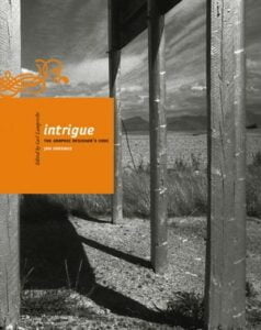
Intrigue – The Graphic Designer’s Code
R240
Balance, iron smelting and optical illusions: A recent encounter with master typographer and award winning graphic designer Jan Erasmus showed me that constructing a typeface is an art in its own right
In stock
Description
Balance, iron smelting and optical illusions: A recent encounter with master typographer and award winning graphic designer Jan Erasmus showed me that constructing a typeface is an art in its own right.
Jan Erasmus is the author and designer of Intrigue: The Graphic Designer’s Code. This book is full of information and showcases a sample of his work from his 25-year long career as an illustrator, graphic designer and typographer. Among many things, Jan is known in type design circles for Thornface, a typeface that draws inspiration from the shapes of thorns, tusks and claws to achieve a wild African feel.
It is no small job for a typographer to get the letters we see on the screen or on the page to look as good as they do. Not only is every curve of every single letter purposefully designed, but the space that each letter occupies and the spacing between the letters is also carefully considered to make the words look balanced. Many type designers, like Jan Erasmus, start their typefaces by hand, using pencil, rubber and paper. The finished images are then scanned and further processed using specialised software.
Designing typefaces is clearly no mean feat. But how does this relate to the world of students, businessmen and anyone, for that matter, sitting in front of their computers writing their anecdotes? Why are we faced with the choice between so many fonts? To answer my own question here, some typefaces have been designed for specific purposes and uses. For example, Verdana looks best on computer screen while Times New Roman looks best printed. Certain typefaces are very decorative and evoke particular imagery, like Jan’s Thornface. Basically, the font you choose for a particular text can affect the readability of the piece. More importantly, text doesn’t just have to be text! When set in the right font, text can form part of the design itself.
Additional information
| Dimensions | 19 × 14 cm |
|---|---|
| Publisher | |
| Language | English |
| Date Published | 2007 |
| Specifications | Softcover, 19x14cm, 116pp, |

